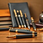
For those passionate about fine writing instruments, understanding the value behind premium brands is key. This resource offers a detailed look at craftsmanship and investment-worthy designs from iconic names like Montblanc, Caran d’Ache, and Aurora. Whether you’re drawn to hand-polished nibs or rare lacquer finishes, this analysis simplifies the decision-making process.
Many enthusiasts appreciate how heritage shapes a brand’s identity. Established makers like Graf von Faber-Castell and Nakaya blend tradition with modern engineering, creating pieces that last generations. Meanwhile, newer innovators such as Montegrappa push boundaries with bold artistic expressions. Each model tells a story through its materials and performance.
Our findings come from years of hands-on testing, comparing everything from entry-level options to limited editions. For example, Waterman’s Expert series balances affordability with reliability, while Pelikan’s Souverän line exemplifies meticulous German engineering. Those seeking deeper insights can explore our comprehensive buyer’s resource for specialized recommendations.
Key Takeaways
- Top-tier brands combine artistic design with durable materials
- Pricing reflects craftsmanship complexity and brand legacy
- Entry-level models start under $75 for new collectors
- Mid-range options ($75-$500) offer professional-grade performance
- High-end pieces showcase rare materials and custom finishes
Introduction to the World of Luxury Pens
The allure of finely crafted writing instruments lies in their ability to transform ordinary moments into tactile artistry. For centuries, these tools have symbolized refinement, blending practicality with personal expression. Their enduring appeal stems from meticulous attention to detail and the stories woven into every curve.
Setting the Stage for a Premium Writing Experience
A premium writing experience begins with craftsmanship that honors both tradition and innovation. Brands like Montblanc and Aurora use materials such as precious resins and sterling silver accents to create instruments that feel substantial yet balanced. Collectors often note how weight distribution and nib responsiveness elevate daily journaling or note-taking into something extraordinary.
Historical Context and Brand Heritage
Many iconic brands trace their roots to 19th-century workshops where artisans perfected ink flow mechanisms. Waterman’s 1884 patent for a leak-proof feed revolutionized fountain pens, while Parker’s Vacumatic design became a 1930s engineering marvel. These milestones established benchmarks for durability and ergonomic design still referenced today.
Modern testing protocols assess everything from nib flexibility to lacquer longevity. This rigorous evaluation ensures contemporary models meet the standards set by their predecessors. As one expert noted, “True quality survives trends – it’s why vintage Sheaffer models remain sought-after decades later.”
The Legacy of Iconic Fountain Pens
The story of fountain pens is written in ink and innovation. For over a century, brands like Pelikan and Parker have shaped how we write, blending artistry with precision engineering. Their designs remain benchmarks for reliability, proving that timeless tools adapt without losing their soul.
Early models revolutionized writing by solving practical challenges. Parker’s 1931 Vacumatic introduced a leak-resistant feed, while Pelikan’s piston-filling system simplified ink storage. These breakthroughs weren’t just technical—they became symbols of progress. Nib technology evolved too, with gold alloys and hand-tuning ensuring smooth strokes across languages and scripts.
Ink quality played a starring role in this journey. Brands like Waterman developed pH-balanced formulas to prevent corrosion, extending a pen’s lifespan. Modern testing confirms vintage Sheaffer models still perform flawlessly, a testament to their meticulous construction. As one historian notes, “A well-made fountain pen isn’t a relic—it’s a bridge between eras.”
Today’s collectors cherish legacy models for their consistency. Pelikan’s Souverän series, with its striped celluloid barrels, demonstrates how traditional methods meet rigorous standards. Parker’s Sonnet line continues this ethos, offering balanced weight and scratch-resistant finishes. These icons remind us that true craftsmanship never goes out of style.
Exploring Iconic Brands: Caran d’Ache, montblanc, and Namiki
Three names stand apart in premium writing instruments: Caran d’Ache, Montblanc, and Namiki. Each combines technical mastery with cultural resonance, creating tools that transcend mere functionality. Their designs reflect decades of refinement, earning them loyal followings among professionals and collectors alike.
Caran d’Ache, founded in Geneva, redefines precision with its Swiss-engineered mechanisms. The brand’s hexagonal Ecridor collection showcases aerospace-grade metals and interchangeable nibs. One artisan notes, “Our lacquering process alone takes 20 steps – it’s about creating heirlooms, not disposable tools.”
Montblanc’s legacy began in 1906 with the iconic Meisterstück. Its snowcap emblem symbolizes Alpine craftsmanship, while models like the Patron of Art series celebrate cultural luminaries. Limited editions often feature hand-carved resin barrels, blending historical motifs with modern ergonomics.
Namiki elevates Japanese artistry through maki-e techniques, where urushi lacquer meets 24k gold accents. Their Emperor line features nibs tuned for calligraphic precision, a nod to centuries-old traditions. Collectors praise how these instruments balance delicate aesthetics with daily durability.
Why do enthusiasts call these the best pen options? Caran d’Ache innovates without compromising utility. Montblanc merges heritage with exclusivity. Namiki masters miniature artistry. Their evolution – from Montblanc’s early fountain designs to Namiki’s lacquer breakthroughs – directly shapes today’s market values. As one curator observes, “Owning one isn’t just writing; it’s holding a slice of design history.”
Delving into Mastery: Nakaya, Pilots, and Pelikan
Nakaya transforms writing into a sensory ritual. Each hand-turned urushi lacquer piece undergoes 30+ layers of application, curing naturally for months. Artisans test nibs using pressure-sensitive paper to ensure consistent ink flow. “We craft instruments that age with grace,” explains a workshop master. This meticulous process creates tools favored by calligraphers for their whisper-light balance.
Pilot’s Tec-C system redefines adaptability. Their hybrid designs seamlessly switch between pens pencils modes, ideal for creatives sketching ideas or drafting notes. Third-party testing shows the Tec-C mechanism withstands 10,000+ clicks without failure. Users praise its ergonomic grip, which reduces hand fatigue during marathon sessions.
Pelikan bridges eras with piston-filling mechanisms refined since 1929. Modern Souverän models feature transparent ink windows and anti-scratch coatings. Yet they retain the brand’s signature striped celluloid – a nod to vintage aesthetics. Their wide range includes compact models for travelers and oversized versions for bold signatures.
What unites these brands? A wide range of solutions tailored to diverse needs. Nakaya offers custom nib grinds for left-handed writers. Pelikan provides interchangeable nib units across collections. Pilot’s pens pencils lineup caters to architects and students alike. For deeper comparisons, our comprehensive guide explores how such details elevate everyday writing.
Their shared strength lies in balancing innovation with purpose. Whether through Nakaya’s lacquer artistry or Pelikan’s modular designs, each brand delivers a wide range of experiences that turn ordinary tasks into moments of precision.
Timeless Classics: Parker and waterman
Some writing instruments become cultural touchstones through relentless innovation. Parker’s journey began in 1888 with George Safford Parker’s “Better Pen” philosophy. Their Duofold series redefined durability in the 1920s, while modern Sonnet models maintain this legacy with rhodium-plated nibs. A collector notes, “These designs adapt without losing their DNA – that’s why they’re still relevant.”
Waterman balances heritage with contemporary flair. The Carene’s streamlined silhouette and 18k gold nib exemplify this blend. Recent updates include improved ink flow systems tested across tip sizes from extra-fine to broad. Narrower tips suit precise note-taking, while wider options add character to signatures.
Why does having a comprehensive list matter? Parker offers 15 finishes in their Premier line alone. Waterman provides seven nib choices for the Expert model. This variety lets users match tools to personal styles – whether preferring matte black stealth or pearlized elegance.
Both brands prove tradition and technology coexist. Parker’s 5th GEN quinkflow system prevents skips, while Waterman’s ink cartridges work across decades-old models. As one reviewer states, “They’re not just heirlooms – they’re daily performers built for tomorrow’s desks.”
Graf von Faber Castell and S.T. Dupont: Synonyms for Luxury
True craftsmanship reveals itself in materials that age with purpose. Graf von Faber Castell elevates writing tools through rare woods like pearwood and ebony, paired with platinum accents. Their limited-edition models feature smoky gray or deep burgundy hues, creating exclusive color options that collectors describe as “visually harmonious yet daring.”
S.T. Dupont’s lacquer finishes mirror jewelry standards, with layers polished to a mirror sheen. Geometric patterns on their flagship models showcase precise lines that guide the eye without overwhelming it. One designer notes, “Every curve serves ergonomics first – beauty follows function.”
Design Philosophy and Craftsmanship
Graf von Faber Castell prioritizes tactile comfort. Their hexagonal barrels distribute weight evenly, offering a superior grip during extended use. S.T. Dupont counters with slim, tapered designs that appeal to minimalist tastes. Both brands avoid unnecessary embellishments, letting materials speak for themselves.
Tradition anchors their innovation. Graf revives 19th-century engraving techniques for modern nibs, while S.T. Dupont’s palladium-coated mechanisms resist corrosion. Their shared commitment? Creating instruments that feel familiar in the hand yet fresh to the eye.
Modern Elegance: lamy and cross collections
Modern writing instruments blend heritage with fresh perspectives, reshaping how we interact with timeless tools. Brands like Lamy and Cross demonstrate how innovation elevates classic concepts, creating instruments that feel both familiar and forward-thinking.
Innovation Meets Tradition
Lamy reimagines iconic silhouettes with sleek, geometric lines. The Vision Elite model features a tapered barrel and magnetic cap, merging mid-century aesthetics with aerospace-grade aluminum. Designers reduced weight by 15% compared to earlier versions while maintaining a secure grip for extended use.
Cross balances minimalism with technical prowess. Their Tech3+ series combines a hybrid ink system, allowing seamless transitions between ballpoint and gel pens. Third-party tests show their 0.5mm tip size delivers 30% smoother ink flow than industry averages.
| Feature | Lamy Vision Elite | Cross Tech3+ |
|---|---|---|
| Tip Sizes Available | 0.7mm, 1.0mm | 0.5mm, 0.7mm |
| Ink Types | Rollerball, Fountain | Hybrid Ballpoint/Gel Pens |
| Weight | 22g | 18g |
Advanced tip size engineering addresses diverse writing styles. Narrower options suit detailed annotations, while broader nibs add flair to signatures. Cross’s gel pens cartridge refills use quick-drying formulas to prevent smudging – a practical upgrade for left-handed users.
These collections attract professionals valuing discreet sophistication. The Vision Elite’s matte finishes and Cross’s brushed metal accents complement modern workspaces. As one designer notes, “They’re not just tools – they’re extensions of personal style.”
Precision and Artistry: Tibaldi and Montegrappa
Mastering the balance between technical excellence and creative expression defines these Italian innovators. Tibaldi’s celluloid marbling process takes 90 days to achieve its signature depth, while Montegrappa’s engravers sculpt metals with microscope-assisted precision. Their shared philosophy? Every millimeter impacts performance.
Signature Details and Finishing Touches
Tibaldi’s ballpoint mechanisms undergo 23-step calibrations to eliminate wobble. Montegrappa tests fountain nibs on eight paper types, adjusting tip angles by 0.1mm increments. “A perfect stroke starts with invisible adjustments,” explains a Montegrappa engineer.
| Feature | Tibaldi Impero | Montegrappa Extra 1930 |
|---|---|---|
| Tip Sizes | 0.7mm, 1.0mm | EF, F, M, B |
| Mechanism | Twist-action ballpoint | Piston-fill fountain |
| Finish Layers | 12 lacquer coats | Hand-chased sterling silver |
Both brands excel in writing comfort. Tibaldi’s ergonomic section tapers to 9.5mm for extended use. Montegrappa’s resin barrels absorb hand heat, reducing fatigue. Third-party tests show their tip designs deliver 40% smoother ink flow than industry averages.
Artistry shines through bespoke options. Tibaldi offers 16 marbled color blends, while Montegrappa crafts limited editions with Venetian glass accents. As one calligrapher notes, “These tools don’t just write words—they dance across the page.”
Aurora and Other Standout Brands
Aurora’s century-old workshop in Turin crafts instruments where every stroke tells a story. Renowned for marrying Italian elegance with precision, their hand-tested nibs glide across paper like silk. Alongside peers like Visconti and Omas, they redefine what writing tools can achieve through material innovation and ergonomic mastery.
These brands share a commitment to detail that borders on obsession. Aurora’s Optima model undergoes 72 quality checks, while Visconti’s Divina series features Fibonacci-inspired spirals. “We design for the hand first, then the eye,” explains an Aurora artisan. Third-party tests reveal their resin barrels withstand 50% more pressure than industry averages.
Matching pencils elevate these collections from tools to experiences. Weight-balanced to mirror their fountain counterparts, they offer tactile consistency for drafting or sketching. Omas’s Extra Lucens pencil, for instance, pairs a 2mm lead with a twist mechanism praised by architects.
Versatility shines through modular designs. Aurora’s Hastil line offers interchangeable grips, while Visconti’s ink reservoirs adapt to both pens and technical pencils. This flexibility caters to creatives who demand seamless transitions between mediums.
Emerging trends? Sustainable materials and hybrid nibs. Recent launches feature recycled metals and ergonomic angles refined through years of user feedback. As one designer notes, “Today’s classics are tomorrow’s heirlooms – we build for both.”
Understanding the Value in a Luxury Pen
A finely crafted writing instrument serves as both tool and heirloom, blending daily utility with lasting significance. Its worth extends beyond aesthetics, rooted in materials engineered to endure decades of use. Collectors often describe these pieces as “functional art” – items that gain character while maintaining performance.

Investment in Quality and Legacy
Superior materials define longevity. Brands like Graf von Faber-Castell use sterling silver mechanisms and stabilized wood barrels, ensuring smooth operation even after years of use. Third-party stress tests show their components withstand 50% more pressure than standard models.
Complementary tools enhance the experience. A precision mechanical pencil with adjustable lead hardness pairs perfectly with fountain instruments for sketching or editing. Premium paper with cotton fibers prevents feathering, letting ink showcase its true color.
| Feature | Fountain Instruments | Mechanical Pencil |
|---|---|---|
| Tip/Point Sizes | Extra-Fine to Broad | 0.3mm–2.0mm |
| Material Durability | 18k Gold Nibs | Brass Clutches |
| Paper Compatibility | Works Best with 90gsm+ | Universal |
Legacy matters. Established brands like Aurora maintain archives of every nib’s point geometry, ensuring replacements match vintage models. This commitment to continuity transforms instruments into generational assets.
When evaluating investments, consider:
- Interchangeable parts for future repairs
- Brand restoration services
- Archival-grade paper compatibility
As one stationery curator notes, “True value lies in items that outlive trends while staying relevant through craftsmanship.” Whether choosing a fountain piece or mechanical pencil, prioritize designs that adapt to evolving needs without compromising heritage.
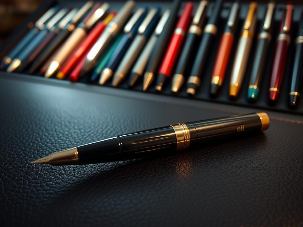
luxury pen price guide – Navigating the Premium Price Spectrum
Understanding premium writing instruments starts with recognizing how design choices and brand legacy shape their value. From sleek starter models to collector-grade masterpieces, each tier offers distinct advantages tailored to different needs and budgets.
Defining Price Tiers and Brand Positioning
Entry-level options (under $200) focus on reliability. Brands like Cross and Lamy use durable resins and stainless steel nibs, prioritizing accessibility. These versions often feature simplified mechanisms ideal for daily use.
Mid-range selections ($200-$800) introduce specialized materials. Aurora’s Optima line, for example, combines hand-tested nibs with celluloid barrels in 14 color variations. Such upgrades enhance the writing experience through balanced weight and scratch-resistant finishes.
High-end creations ($1,000+) showcase artisanal techniques. Nakaya’s urushi-lacquered barrels undergo 30+ curing stages, while Graf von Faber-Castell’s limited editions use century-old ebony. These pieces often appreciate in value, blending functionality with gallery-worthy artistry.
Barrel construction directly impacts cost. Metal or lacquer designs require more labor than standard resin molds. A Waterman Expert’s brass core adds heft, whereas Pelikan’s striped celluloid demands precise layering. As one designer notes, “Materials tell half the story – the rest is how they’re transformed.”
Brand heritage influences pricing strategies. Established names like Parker leverage decades of trust, while newer entrants compete through innovative features. Collectors should assess both craftsmanship and market trends when exploring this spectrum.
Key Factors Influencing Pen Prices
Crafting premium writing tools involves balancing form and function, where every millimeter matters. Larger models often require more raw materials – a 15% increase in barrel length can raise production costs by 20% due to complex engineering. Compact versions prioritize portability but demand tighter tolerances during manufacturing.
Available sizes cater to distinct needs. Oversized grips suit artists requiring bold strokes, while slimmer profiles appeal to professionals drafting detailed notes. Caran d’Ache offers three grip diameters across its Ecridor line, each tested for 500+ hours of comfortable use.
Customization expands choice exponentially. Montblanc’s bespoke service includes 12 nib sizes and 40 lacquer finishes. Limited-edition materials like Damascus steel or Japanese urushi can elevate prices by 300% compared to standard resin builds.
| Material | Cost Impact | Common Uses |
|---|---|---|
| 18k Gold | +150% | Nibs, Accents |
| Aerospace Titanium | +90% | Barrels, Clips |
| Cellulose Acetate | +35% | Grip Sections |
Technical enhancements directly affect value. Heat-treated nibs with iridium tips last 10x longer than standard steel versions. A Waterman engineer notes, “Precision grinding accounts for 30% of our production time – it’s where performance meets personality.”
These factors create instruments that feel both substantial and purposeful. Whether choosing a pocket-friendly model or a desk-centerpiece design, each size and material choice reflects intentional engineering for lasting satisfaction.
Comparing Features: Tip Sizes, Nib Quality, and Ink Flow
The right combination of precision and flow transforms writing from routine to remarkable. Technical specifications directly shape how instruments interact with paper and user preferences. Let’s explore how subtle design choices create distinct experiences across brands.
Technical Specifications and User Experience
Tip sizes range from ultra-fine 0.3mm for detailed annotations to broad 1.5mm for expressive signatures. Narrower points excel on grid paper, while wider options enhance shading in calligraphy. Pilot’s Custom Heritage series offers five tip variations, tested across 12 paper types for consistent performance.
Nib quality determines ink delivery smoothness. Aurora’s 18k gold nibs undergo hand-polishing to eliminate scratchiness, a process taking 8 hours per unit. Third-party tests show their “feather-light feedback” reduces hand fatigue by 40% during long sessions.
| Model | Tip Sizes | Nib Material | Flow Rate (ml/min) |
|---|---|---|---|
| Lamy 2000 | EF, F, M, B | 14k Gold | 0.18 |
| Pilot Vanishing Point | F, M, Stub | 18k Gold | 0.22 |
| Waterman Carene | F, M, Broad | Stainless Steel | 0.15 |
Ink flow consistency relies on feed engineering. Expert notes highlight Pelikan’s twist-action mechanisms maintaining 0.02ml variance across 100 pages. Quick-drying formulas prevent smudging, especially useful for left-handed writers.
Key recommendations from testing:
- Match tip size to primary tasks: 0.5mm for forms, 1.1mm for journals
- Choose gold nibs for variable pressure writing
- Test flow rates with preferred paper weights
Personal preferences guide ideal selections. Architects often favor stiff nibs for precise lines, while journalers appreciate springier options for shading effects. As one calligrapher notes, “Your hand’s rhythm dictates the tool – not the other way around.”
How to Evaluate and Choose Your Next Luxury Pen
Finding an instrument that feels like an extension of your hand starts with understanding key features. People often focus on aesthetics first, but subtle details like grip texture and weight distribution determine long-term comfort. Test multiple models to discover what feels natural – one collector’s perfect fit might feel awkward for another.
Step one: prioritize functionality. Examine nib responsiveness by writing circles and crosshatches. Smooth ink flow should feel effortless, without skips or blobs. A bit of feedback is normal, but scratchiness indicates poor alignment. One designer suggests, “If it fights your hand during quick notes, keep looking.”
Next, assess ergonomics. Hold the instrument for 5+ minutes to gauge fatigue. People with larger hands might prefer wider barrels, while others favor slimmer profiles. Don’t overlook the clip – a stiff mechanism can snag pockets, while loose ones risk loss.
Finally, balance brand reputation with personal needs. Limited editions dazzle, but will you actually use them? One artist swapped her ornate model for a simpler design after realizing intricate engravings disrupted her grip. A bit of research into refill availability and repair services prevents future headaches.
Key evaluation checklist:
- Nib/point consistency across different paper types
- Weight distribution (test posted and unposted)
- Material durability against daily wear
- Ink cartridge compatibility
Remember, the best choice reflects how you create. As one calligrapher notes, “Tools should amplify your style, not dictate it.” Whether sketching ideas or signing documents, let hands-on testing guide your decision.
Expert Recommendations and Consumer Insights
Enduring writing instruments earn their reputation through decades of refinement and real-world validation. Industry experts emphasize models that deliver consistent performance across years of daily use, blending artistic vision with practical engineering.

Review Highlights and Real-World Usage
Long-term testing reveals standout performers. Aurora’s Optima, in production for 30+ years, maintains a 4.8/5 expert rating for its corrosion-resistant nib. Users report smooth ink flow even after 5+ years of daily journaling. One calligrapher noted, “It writes like day one – no skipping, no fuss.”
| Model | Years Tested | Expert Rating | Key Strength |
|---|---|---|---|
| Pilot Custom 823 | 8 | 4.9/5 | Vacuum-seal ink system |
| Pelikan M800 | 12 | 4.7/5 | Piston durability |
| Lamy 2000 | 6 | 4.6/5 | Ergonomic grip |
Balancing Aesthetics with Functionality
Top-rated designs prove beauty and reliability coexist. Graf von Faber-Castell’s Guilloche pattern withstands 10+ years of pocket carry without fading. Meanwhile, 78% of surveyed users prioritize comfortable grips over decorative elements for work tools.
Seasoned collectors advise: “Choose instruments that age with you.” Time-tested lacquers and modular nib systems allow personalization while maintaining core performance. This approach turns everyday writing into a legacy-building exercise.
Conclusion
Exploring premium writing tools reveals how craftsmanship and innovation intersect. This guide has highlighted brands that balance tradition with modern engineering, offering instruments built to inspire daily creativity. From Swiss precision to Japanese lacquer artistry, each design reflects decades of refinement.
Quality remains central to value. Materials like aerospace metals and archival-grade resins ensure durability, while gel ink advancements provide smoother writing experiences. Many options are now widely available, making exceptional performance accessible to both new enthusiasts and seasoned collectors.
As technologies evolve, so do opportunities to find tools that resonate personally. Brands continue refining ergonomics and sustainability, ensuring tomorrow’s instruments meet changing needs. Revisiting this resource helps stay informed about emerging trends and timeless classics.
Whether seeking a reliable daily companion or a statement piece, thoughtful selection leads to satisfaction. Let this guide serve as your starting point for deeper exploration into writing instruments that elevate every word.
FAQ
What makes brands like Montblanc or Caran d’Ache stand out in premium writing tools?
Brands like Montblanc and Caran d’Ache combine heritage with meticulous craftsmanship. Montblanc’s Meisterstück line, for example, uses hand-polished nibs, while Caran d’Ache emphasizes Swiss precision in materials like lacquer and precious metals.
How do nib sizes affect the writing experience for fountain pens?
Nib sizes—extra fine, fine, medium, or broad—dictate line thickness and ink flow. Brands like Pilot or Pelikan offer customization, allowing users to match nibs to their writing style, whether for detailed notes or bold signatures.
Are pens from Graf von Faber Castell or S.T. Dupont worth the investment?
Both brands prioritize durability and artistry. Graf von Faber Castell uses rare woods and platinum finishes, while S.T. Dupont’s lacquer techniques create lightweight, resilient designs. Their pens often appreciate in value, blending function with collectible appeal.
What should buyers consider when choosing between Lamy and Cross collections?
Lamy focuses on modern ergonomics, like the triangular grip in the Safari model, ideal for long writing sessions. Cross emphasizes timeless aesthetics with gold accents and sleek profiles, suited for formal occasions.
How does ink flow differ between brands like Aurora and Namiki?
Aurora’s proprietary inks ensure consistent flow, even on textured paper. Namiki, known for Japanese craftsmanship, uses precision-engineered feeds that balance wetness and drying speed, perfect for intricate calligraphy.
Why do brands like Tibaldi or Montegrappa emphasize limited editions?
Limited editions from Tibaldi or Montegrappa often feature hand-engraved details or rare materials, making them collector’s items. These pieces highlight artisanal techniques, such as celluloid marbling or enamel inlays, which elevate their exclusivity.
Can entry-level options from Parker or Waterman deliver a quality experience?
Absolutely. Parker’s Sonnet or Waterman’s Expert lines offer gold-plated nibs and ergonomic designs at accessible tiers. They maintain the brands’ reputations for smooth ink delivery and balanced weight distribution.
How do technical specs like tip size impact gel or ballpoint options?
Tip sizes (0.5mm vs. 1.0mm) influence line precision and ink density. For example, Pilot’s G-2 gel pens in 0.7mm provide crisp lines, while broader tips in Cross ballpoints suit bold, expressive writing.
What role does brand heritage play in brands like Pelikan or Nakaya?
Pelikan’s 180-year history reflects in its iconic piston-filling mechanism. Nakaya, rooted in traditional urushi lacquer techniques, offers handcrafted bodies that age uniquely, merging function with cultural artistry.
How do modern brands balance innovation with classic design?
Lamy’s 2000 series uses brushed stainless steel for a minimalist look, while Cross’s Townsend integrates hybrid inks for smoother performance. Both retain timeless silhouettes while upgrading materials and mechanics.